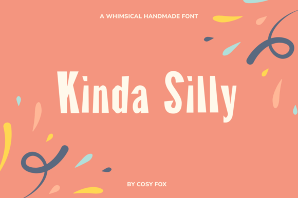
Kinda Silly: A Playful Display Font That Delights in Digital Spaces
I was halfway through building a landing page for a new creative coaching program when I paused—staring at the hero section, where the headline felt polite but forgettable. I swapped in Kinda Silly, typed “You’ve Got This,” and watched the whole layout exhale. Suddenly, it wasn’t just clear—it was warm, human, and quietly confident. That’s the first thing you’ll notice about Kinda Silly: it doesn’t shout. It winks.
A Hand-Drawn Typeface with Real Web Personality
Kinda Silly is a display font—designed not for paragraphs, but for moments that need personality. Its letters are irregular, slightly uneven, and full of hand-drawn charm: soft curves, gentle tapering strokes, and subtle variations in weight and baseline that mimic real ink on paper. It’s not chaotic—it’s intentionally kinda silly, never fully absurd. That restraint makes it surprisingly versatile in digital design: friendly enough for a wellness brand, playful enough for a kids’ learning app, and distinctive enough to anchor a boutique online store’s visual identity.
How It Performs Where It Matters Most
I tested Kinda Silly across real web contexts—not just mockups, but live previews on iOS, Android, and desktop Chrome. Here’s what stood out:
- Hero headlines pop beautifully, especially over soft image backgrounds or muted gradients. Its medium contrast and open letterforms hold up well even at 48–64px on large screens.
- Section headings (like “What You’ll Learn” or “Meet Your Coach”) add rhythm without competing—especially when paired with a clean, neutral sans serif like Inter or Manrope for body copy.
- Call-to-action buttons work best at 20–24px with generous padding. At smaller sizes or tight spacing, some characters (like the lowercase a or g) begin to soften visually—but that’s expected for a display font, and easily avoided with smart sizing.
- Mobile responsiveness is solid. On iPhone-sized viewports, I kept Kinda Silly at 32px for H2s and used font-display: swap to ensure fast loading without flash-of-unstyled-text.
Where It Shines—and Where to Step Back
Kinda Silly excels in short, high-impact roles: logo lockups, campaign banners, testimonial quotes, course module titles, and blog post headers. I used it for a “Free Resource Library” banner on a portfolio site—and instantly noticed how it guided attention without needing animation or color tricks.
But it’s not meant for everything. I tried it for navigation labels and quickly reverted: too decorative for small, functional text. Same goes for form fields, footer links, or dense comparison tables. For accessibility and usability, stick to highly legible sans serifs there. And while its multilingual support (French, German, Spanish, Italian, Portuguese) is thoughtful, I double-checked diacritics in live preview—especially accented uppercase letters—and found them well-spaced and consistent across browsers.
Smart Pairing Makes All the Difference
One of the quiet strengths of Kinda Silly is how gracefully it pairs. Because it’s a single-weight display font (no bold or italic variants included), pairing isn’t optional—it’s essential for hierarchy and balance. My go-to combo? Kinda Silly for headlines + Inter (variable or static) for everything else. The neutrality of Inter lets Kinda Silly breathe, while its excellent hinting ensures crisp rendering at all sizes—even on lower-DPI screens.
For more editorial or luxury-leaning sites, I’ve paired it successfully with a light serif like Cardo or Lora—the contrast between organic playfulness and refined structure creates instant character. Just avoid pairing it with other decorative fonts; two whimsical typefaces tend to cancel each other out rather than complement.
Practical Notes Before You Launch
Before deploying Kinda Silly in a client project or live shop, I always verify three things: First, the font files include WOFF2 (for modern browsers) and WOFF (for broader support)—both were present and optimized. Second, the license explicitly permits web embedding and commercial use (it does—great for SaaS dashboards, course platforms, or e-commerce banners). Third, I check for fallback behavior: defining a system stack like font-family: "Kinda Silly", -apple-system, BlinkMacSystemFont, "Segoe UI", sans-serif; keeps the experience stable if the font fails to load.
Also worth noting: while Kinda Silly includes language support for five major European languages, it doesn’t cover Cyrillic, Greek, or extended Latin-1 characters—so if your audience spans broader regions, plan accordingly. And though it’s not a variable font, its single, well-drawn weight holds up remarkably well across devices when used intentionally.
More Than a Font—A Tone-Setting Tool
What makes Kinda Silly special isn’t just how it looks—it’s how it shifts the tone of an entire interface. On a coaching site, it signals approachability before a single word is read. In a creative product launch, it hints at craft and care. Even in a minimalist portfolio, it adds warmth without clutter. It reminds users—subtly, warmly—that there’s a real person behind the pixels.
If you’re choosing a display font to represent voice, values, or vibe—not just visual style—Kinda Silly earns its place. Not as background noise, but as a thoughtful, human-centered accent. One that doesn’t try to be everything, but does exactly what it promises: delight, lightly.